T22
A plan that develop local industries by design
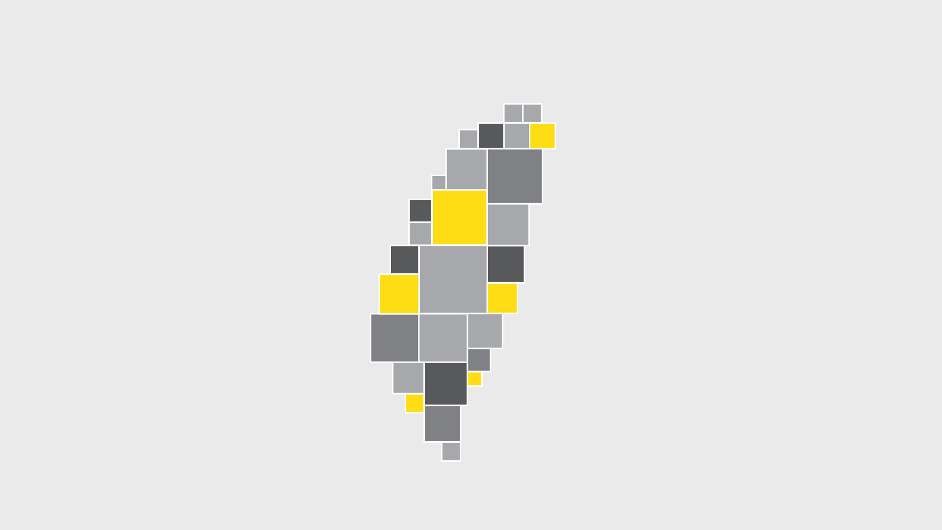
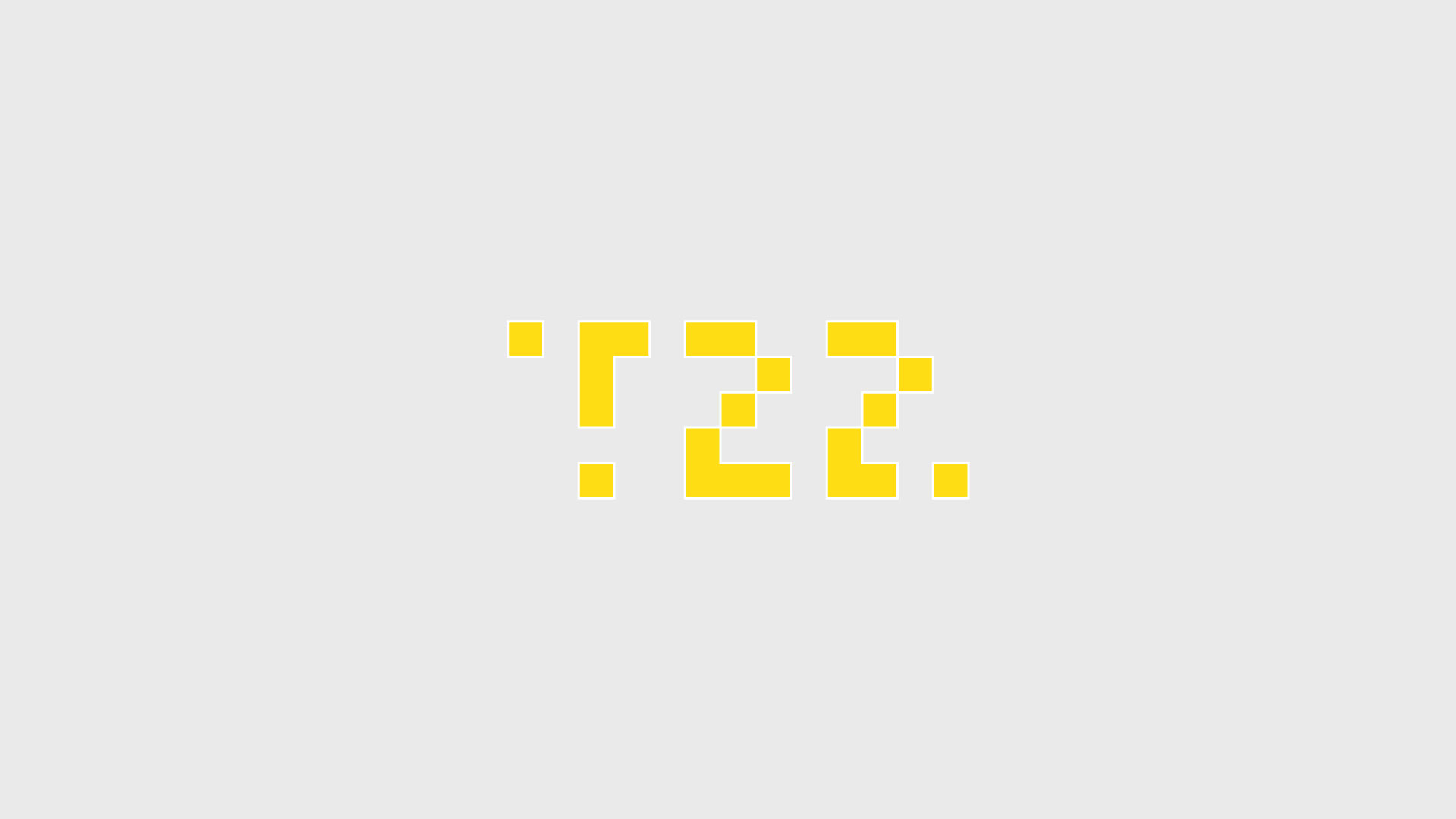
T22 is a new production area revitalization plan launched by the Taiwan Design and Research Institute, integrating domestic and foreign professional resources, and serving as a consultant and a resource matching platform. T stands for Taiwan, and 22 stands for 22 counties and cities in Taiwan. We were invited by the Whiter design to make a animation for the logo.
T22是台灣設計研究院全新推出的產地振興計畫,整合國內外專業資源,以顧問及資源媒合平台的角色。T代表台灣,22則為台灣22個縣市。我們受角白設計邀請,替LOGO製作動態。
We use squares as units to convert between text and Taiwan graphics. Three different feeling films were also proposed with the same concept.
我們用方塊為單位,在文字與台灣圖形轉換。也用相同概念分別提出三種不同感覺的影片。


